# load packages
library("dplyr")
library("ggplot2")
library("rvest")Recreating NFL Scorigami with R
Not All Scores are Created Equal
What is Scorigami? Allow Jon Bois1 to explain:
This post will attempt to recreate the main visualization seen throughout this video. This post is certainly not the first Scorigami data product to be created in response to this video.
If you’re an NFL fan, and you find Scorigami interesting, the Twitter account will be particularly useful, as it tweets alerts during games that have a high probability of ending in Scorigami.
Tools
To perform this reproduction, we will use the R programming language. We’ll also use three R packages:
rvest, for obtaining data stored as an HTML table.dplyr, for transforming data.ggplot, for plotting data.
Data
To recreate the Scorigami visualization, we will need data on the resulting score of every NFL game ever played. Thanks to the excellent series of Sports Reference websites, in particular Pro Football Reference, this data is almost too easy to obtain. Pro Football Reference actually maintains a page dedicated to this data:
It is so perfect, the data is already wrangled and summarized in the exact format we would have wanted.
# download and wrangle data
url = "https://pro-football-reference.com/boxscores/game-scores.htm"
nfl_data = {
  read_html(url) |>
    html_node("table") |>
    html_table() |>
    select(w_score = PtsW,
           l_score = PtsL,
           n = Count)
}
# preview wrangled data with kable formatting
knitr::kable(
head(nfl_data, n = 10),
align = "c",
col.names = c("Winning Score", "Losing Score", "Count"),
caption = "Ten Most Common NFL Scores"
)| Winning Score | Losing Score | Count |
|---|---|---|
| 20 | 17 | 282 |
| 27 | 24 | 230 |
| 17 | 14 | 200 |
| 23 | 20 | 199 |
| 24 | 17 | 173 |
| 13 | 10 | 167 |
| 24 | 21 | 156 |
| 17 | 10 | 144 |
| 16 | 13 | 143 |
| 24 | 14 | 139 |
This exercise was originally performed as part of a lab for STAT 385, Statistical Programming Methods, at Illinois. For that use, we instead obtained data using the nflreadr package. The advantage of obtaining the data this way was that we could obtain the data for each game, then make the necessary transformations and summaries ourselves. However, this package only makes data available going back to the 1999 season, while the NFL has been around since 1920.
In addition to data on every NFL score ever, we need to create data for every NFL score that will never happen.
# df of impossible scores per nfl rules
impossible = tibble(
  l_score = c(0, 1, 1, 1, 1, 1, 1),
  w_score = c(1, 1, 2, 3, 4, 5, 7)
)

# add impossible scores based on win-loss relationship
for (i in 0:100) {
  temp = tibble(
    w_score = i,
    l_score = (i + 1):100
  )
  impossible = bind_rows(impossible, temp)
}
Visualization
With the data obtained and wrangled, all that is left to do is create the visualization The code to do so could look intimidating, but the bulk of the work is done by the geom_tile function from ggplot2, with some important modifications done via the coord_fixed function. The remaining code is mostly for modifying the aesthetics of the plot.
# future args for plot limits
mwin = max(nfl_data$w_score) + 0.5
mlos = max(nfl_data$l_score) + 0.5
# create plot
ggplot(data = nfl_data) +
aes(
x = w_score,
y = l_score
) +
geom_tile(
data = impossible,
color = "black"
) +
geom_tile(
color = "darkgreen",
fill = "chartreuse4"
) +
geom_text(
mapping = aes(label = n),
color = "white",
size = 1.75
) +
coord_fixed(
ylim = c(mlos, -0.5),
xlim = c(-0.5, mwin),
expand = FALSE
) +
scale_x_continuous(
breaks = 0:100,
minor_breaks = NULL,
sec.axis = dup_axis()
) +
scale_y_continuous(
breaks = 0:100,
minor_breaks = NULL,
sec.axis = dup_axis()
) +
theme_classic(
base_line_size = 0
) +
theme(
axis.text = element_text(size = 6),
plot.caption = element_text(size = 6, color = "grey"),
axis.title = element_text(size = 8)
) +
labs(
x = "Winning (or Tying) Score",
y = "Losing Score",
title = "NFL Scorigami",
subtitle = "1920 - 2021",
caption = "Inspired by Jon Bois' Chart Party"
)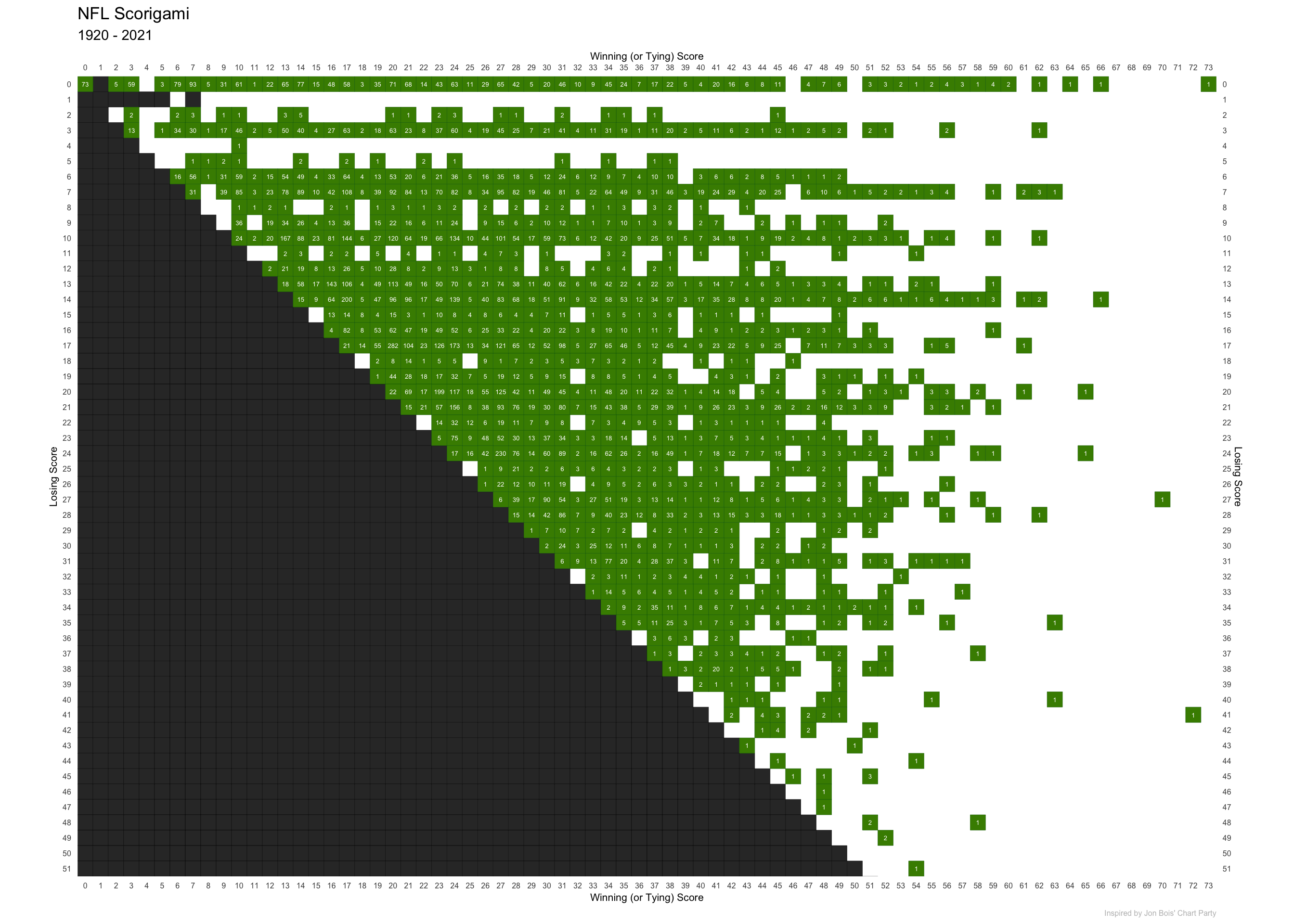
Open this image in a new tab or window to see the full resolution version.
Full Code
If you’d like to easily recreate this plot yourself, the following chunk contains all of the necessary code from above.
# load packages
library("dplyr")
library("ggplot2")
library("rvest")
# download and wrangle data
url = "https://pro-football-reference.com/boxscores/game-scores.htm"
nfl_data = {
read_html(url) |>
html_node("table") |>
html_table() |>
select(w_score = PtsW,
l_score = PtsL,
n = Count)
}
# df of impossible scores per nfl rules
impossible = tibble(
l_score = c(0, 1, 1, 1, 1, 1, 1),
w_score = c(1, 1, 2, 3, 4, 5, 7)
)
# add impossible scores based on win-loss relationship
for (i in 0:100) {
temp = tibble(
w_score = i,
l_score = (i + 1):100
)
impossible = bind_rows(impossible, temp)
}
# future args for plot limits
mwin = max(nfl_data$w_score) + 0.5
mlos = max(nfl_data$l_score) + 0.5
# create plot
ggplot(data = nfl_data) +
  aes(
    x = w_score,
    y = l_score
  ) +
  geom_tile(
    data = impossible,
    color = "black"
  ) +
  geom_tile(
    color = "darkgreen",
    fill = "chartreuse4"
  ) +
  geom_text(
    mapping = aes(label = n),
    color = "white",
    size = 1.75
  ) +
  coord_fixed(
    ylim = c(mlos, -0.5),
    xlim = c(-0.5, mwin),
    expand = FALSE
  ) +
  scale_x_continuous(
    breaks = 0:100,
    minor_breaks = NULL,
    sec.axis = dup_axis()
  ) +
  scale_y_continuous(
    breaks = 0:100,
    minor_breaks = NULL,
    sec.axis = dup_axis()
  ) +
  theme_classic(
    base_line_size = 0
  ) +
  theme(
    axis.text = element_text(size = 6),
    plot.caption = element_text(size = 6, color = "grey"),
    axis.title = element_text(size = 8)
  ) +
  labs(
    x = "Winning (or Tying) Score",
    y = "Losing Score",
    title = "NFL Scorigami",
    subtitle = "1920 - 2021",
    caption = "Inspired by Jon Bois' Chart Party"
)Future Work
If you’re a student looking for a weekend project to test and improve your data skills, consider attempting to create a more interactive version of this visualization using Shiny. The NFL Scorigami website should give you a number of ideas for how to add interactivity to this visualization.
Footnotes
Along with Alex Rubenstein, Jon wrote, narrated, and produced the documentary The History of the Seattle Mariners. If you have four hours to fill, I highly recommend it.↩︎